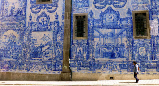


Porto is a coastal city in northwest Portugal known for its soaring bridges, Port wine and decorative blue and white tiles that have been a feature of the city's architecture for centuries. In the medieval Ribeira district, narrow cobbled streets wind past merchants’ houses and cafes, medieval relics, majestic bell towers, extravagant baroque churches and stately beaux-arts buildings.
Over the past decade or so Porto has undergone a remarkable renaissance with a new and efficient metro system and notable architectural additions including Rem Koolhaas’ Casa da Música. A popular long weekend getaway for Europeans in search of the sun, the city's graphic identity is a reflection of the increasingly cosmopolitan lifestyle offered by this ancient city.
The words below are from www.atissuejournal.com:
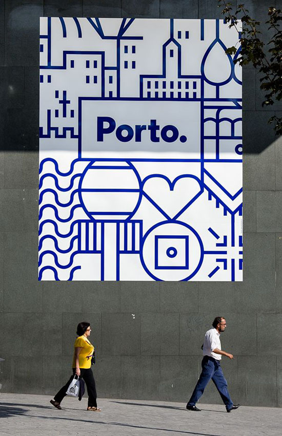
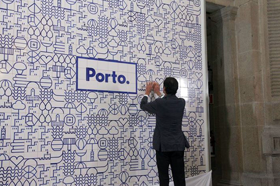
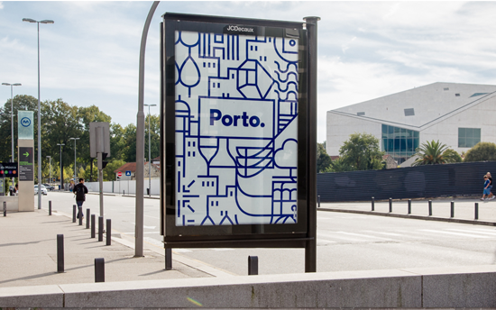
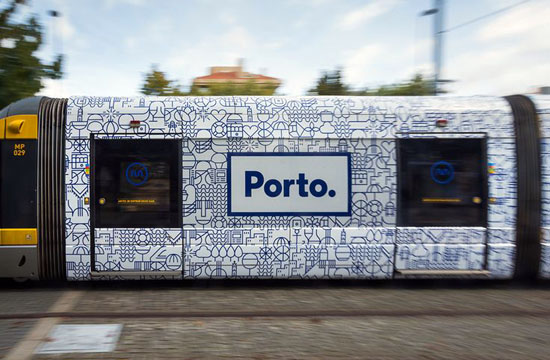
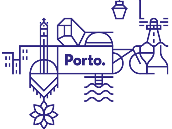
"When it came to designing a graphic identity for the city of Porto in Portugal, one visual symbol wasn’t enough. Porto-based design firm, White Studio, brainstormed what made Porto memorable and unique, and asked people on the street how they viewed the city. No two answers were alike. White Studio concluded, “We felt we needed to give each citizen their own Porto. We needed to show all of the cities that exist in this one territory….It became clear to us that Porto needed to be much more than a single icon, much more than a single logo. It needed complexity. It needed life. It needed stories. It needed personality.”
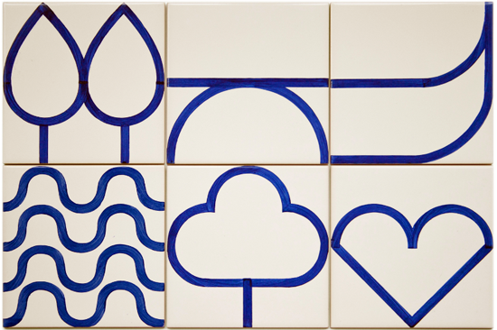
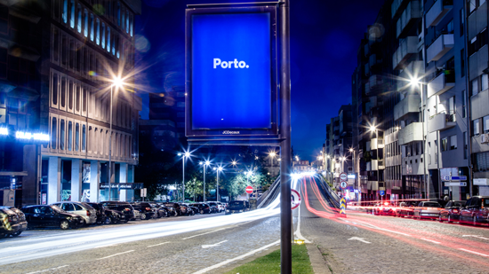
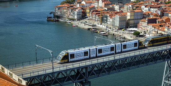
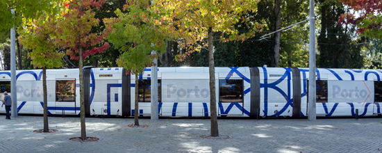
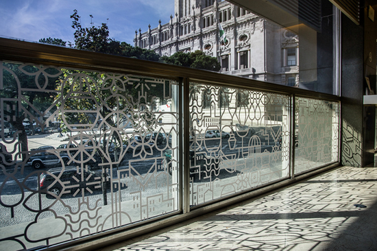
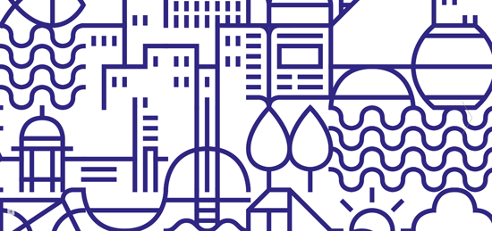
The designers also needed a way to create a single unified look that would serve as Porto’s one graphic identity. The answer came in the decorative blue ceramic tiles seen throughout the city for centuries. The line drawings and illustrations on the tiles depicted visual stories about Porto’s history, landmarks, and natural surroundings. That inspired White Studio to create 70 pictograms that represented Porto and its people. The pictograms were designed to fit on a grid that could be combined into a network of images or used individually. The logotype itself is a simple blue sans serif against a white background within a blue boxed border. The beauty of this visual system is that it allows elements to be changed out frequently and still be recognizable as Porto’s graphic identity. It works."
Images via www.underconsideration.com and White Studio, Rua Alexandre Braga 94, 1ºEsq. 4000-049 Porto, Portugal
#PODfinds