 When I was a kid we would go on an annual family holiday by car (OMG can you imagine driving from Melbourne to Maroochydore with 5 kids in the back seat of a sedan during a stinking hot summer in the days when air con meant winding the window down?!). My job was 'chief map reader' as Mum was 'geographically challenged' (or probably delirious at the entire prospect of a 'holiday').
Last August I reported on the new look Coles rolled out in Claremont Quarter, Perth. At the time the design was certainly going in the right direction but the detailed way-finding and brand elements were missing... they seem to have consulted a good brand map since then.
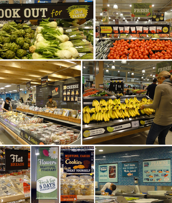
Just last Thursday Coles rolled out a significantly more developed concept in Tooronga. Signposting has improved dramatically and there is lots of helpful information, particularly in the fresh produce department. The staff spruiking the seasonal specials didn't sound scripted (now that is an achievement outside our traditional fresh produce markets). The graphic look is friendly, the content helpful (seasonal and usage based) and quality guarantees are thrown in for good measure. My first thought was that the visual communication might be inspired by the Jamie Oliver magazine? Whilst driving on price is the Coles direction, the freshness and quality message was strong. Value was being delivered left right and centre (a 6 pack of scotch filet steaks for $10!! and as an opening special shoppers received 10% off for spending over $100). Given we are in footy finals season, I would say that from a brand shift perspective Coles has taken a specky and then kicked a pretty decent goal. ps. soz about the pics - my snoop snaps are not the best.


