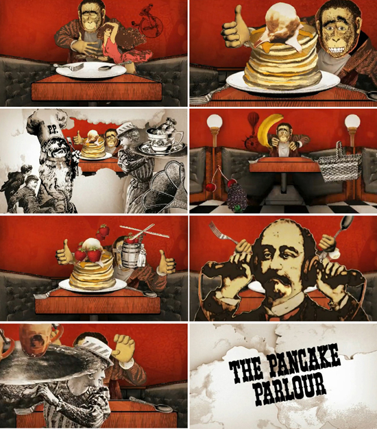
 In all my born days I would never have thought I'd be giving airtime to the PP. I think the last time I set foot in a store was post-movie with my 10 year old niece (who is now 22). It's just not on my dining radar... but the Ad currently running on the Telly tingled my antenae. Firstly, I thought it was really clever. Secondly, I liked it. This surprised the living daylights out of me as I am not a PP fan (menu, decor, anything, full stop). But rather than go down that path, I recall the advice of a v. good Texan friend ... "oh, just put on some lipstick, smile and be nice". Here is my 'be nice' :
The collage style graphic treatment is right on trend, and yet it is instantly recognisable as the brand I have known for at least 30 years ... the whimisical characters inspired by Alice in Wonderland, the old guy with the 2 phone handles stuck to his head (whom I would guess has been part of the story since day 1) etc. are all still there and they're sort of cool in this context.
The logo/typeface looks the same to me as I recall it did when I was a teenager. Maybe they've refined it slightly, but not enough for me to notice. All you Typomaniacs out there would probably have a 3 day debate on why you don't think it is absolutely 'fontastic', but I actually think it works here.
Take a look for yourself, its on YouTube. Oh and BTW, let me know if you think I'm a pancake short of a stack on this one wont you - Lovely!


