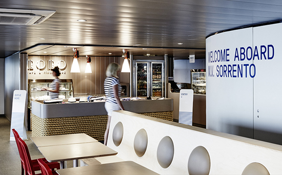
Melbourne is home to some stand out design firms (and yes, I appreciate there is no news in that statement). Seemingly every time some clever design fabulousness crosses my desk these days it is the work of Techne Architects + Interior Design. I have to admit I am a touch smitten with their residential and retail work in particular.
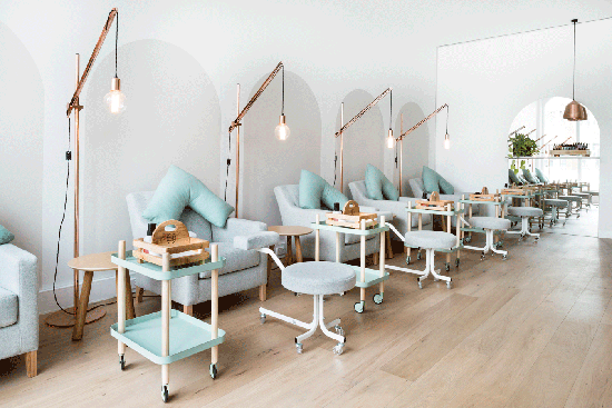
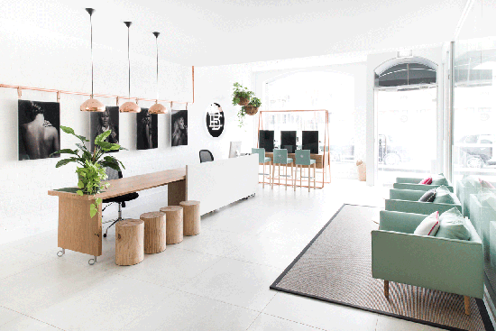
For me, one of the immediate outcomes of good retail design should be trust. It makes you want to step inside and, once in the door, you immediately feel like the space and staff know its purpose and the service and product is going to be good. It sets the tone for the brand positioning and price point. The space says you can trust your instincts that this is something that will appeal to who you are as a person. First impression tells me Beauty EDU is a modern beauty bar / spa / salon. It is, but for those still learning the ropes of the pampering trade!
I don't have much experience with beauty training schools but if I scratch around in my memory vault I recall with great hilarity the worst haircut I have ever seen (many years ago a gal pal, trying to save a few pennies, went and got a cut & colour by a student at a "hairdressing academy" that I hope is no longer in business). I always imagined such establishments to have crap fluorescent lighting, chipped paint on the walls and 'oops missed' blobs of wax stuck in places where it shouldn't be. The sort of establishment where you feel nervous for your eyebrows or toenails before they've let the inexperienced lay a finger on you.
Beauty EDU turns the idea of, what I imagined, a training school looks like completely on its head. Here is how Techne describe it:
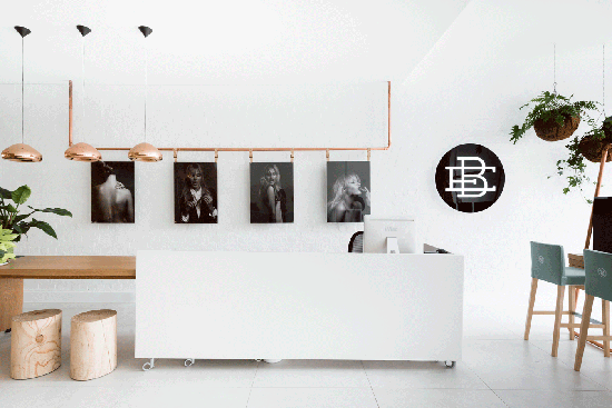
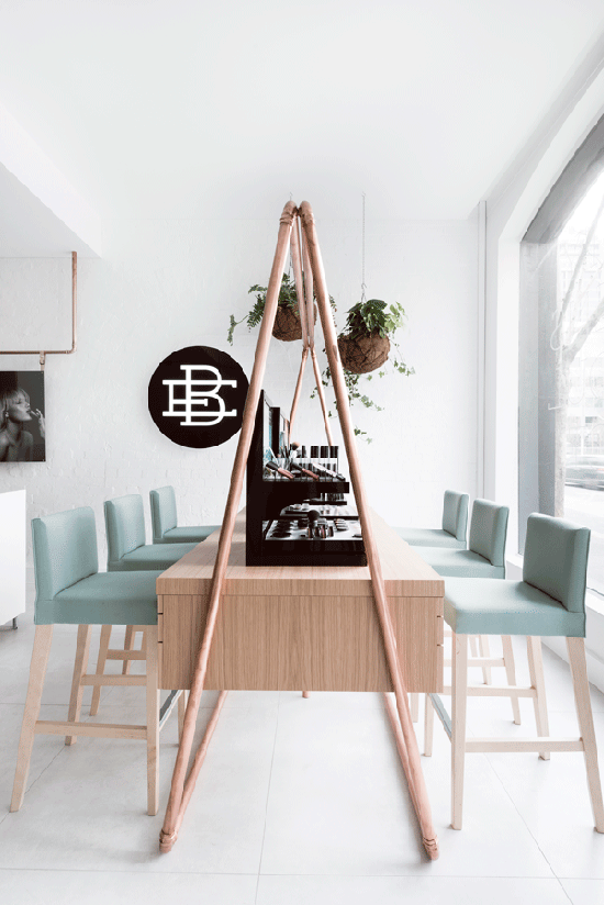
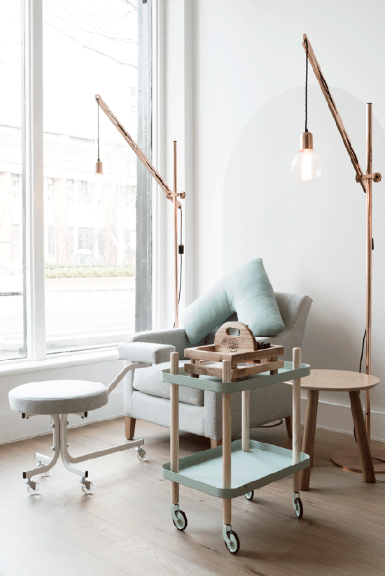
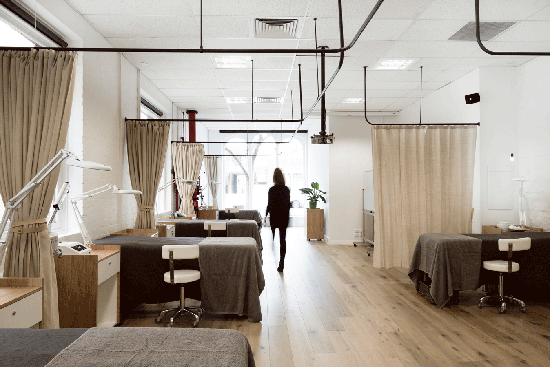
"With the concept of offering a new approach to practicing beauty therapy in mind, the aim was to create a retail environment that was simple, clean and unlike anything else on the market. The reception area is the main attraction in the Beauty EDU fitout. This area is the hub of the space, with a large desk for clients to perch at with copper and timber detailing. From the reception space, there are views into treatment, meeting and classroom areas, giving a sense of what is happening behind the scenes. White washed timber and accents of mint are used throughout the space, to tie in with the Beauty EDU brand. The finished result is a space that provides a professional environment and sets the tone of the high standards of the school. And of course a space where the students will enjoy coming to learn." #techne #beautyedu #gooddesign #podfinds
Images and quote via techne.com.au.
You can find the talented Techne team at L2, 34 Hardware Lane Melbourne. Photography by Tom Blachford
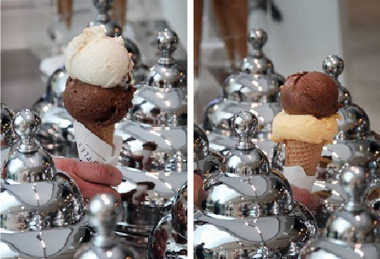
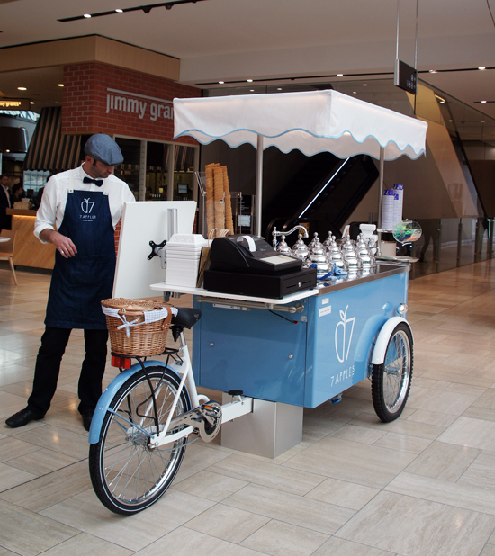

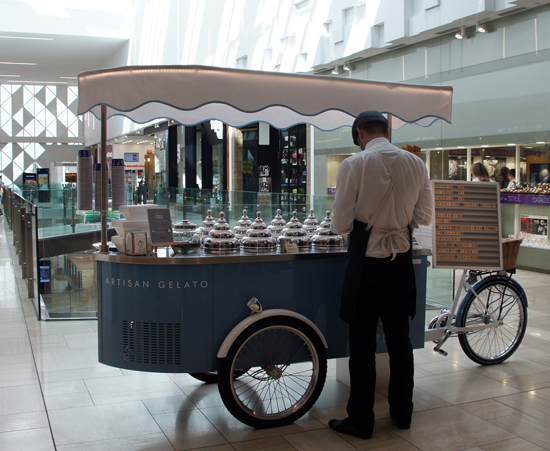
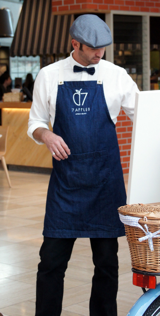 7 Apples Gelato has always been good. I thought their pop up cart, spied at Emporium, especially good. Lovely attention to detail in the branding and delivery and the dapper chappie's uniform is, of course, de rigueur. I would love to know the name of the baby blue paint colour if anyone can help - its gorgeous!


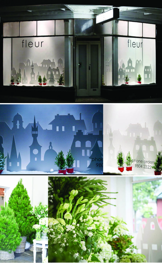 I loved the simplicity and night lighting effect of Fleur's Christmas windows this festive season. Inside it was all fresh green and white topped off with the wonderful smell of pine trees. You can find Fleur and her fabulous flowers in Rose Street, Armadale, Melbourne.
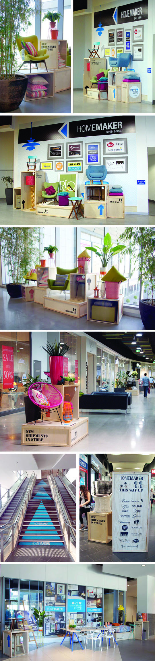
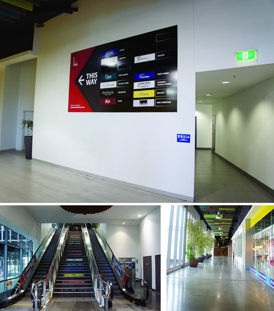
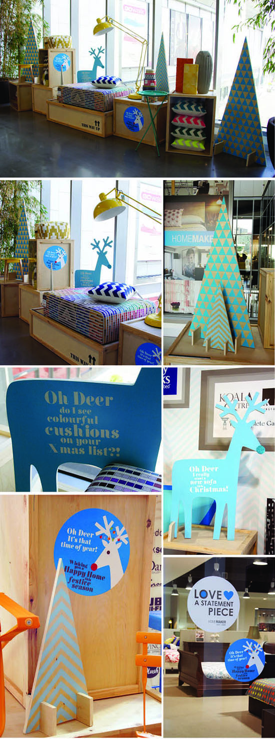 With Christmas only a fortnight away and spending about to ramp up a notch or 10, these super cute ply trees and mini reindeers were added to the South Wharf Homemaker VM campaign POD designed and installed back in October. Reinforcing the 'directional blue arrow' for the new in-centre signage and coordinating with the industrial look shipping crates, both the POD Peeps and our lovely client, Jess Harney, think they have come up a treat! "Oh Deer, it's that time of year' creative, design and install by POD with super assistance by @Comer&King. #homemakerSW #statementpiece #christmasdecs @podfinds