Making it Happen

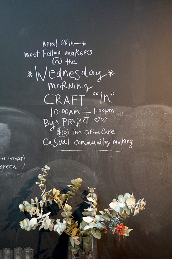
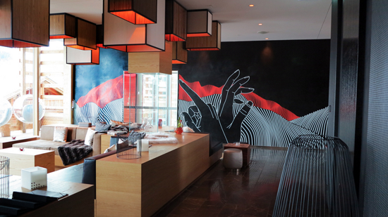
Retailing is a complex business with multiple channels for vendors to promote and sell their wares. Dubbed 'The Experience Economy', we now want a hell of  a lot more from a store.  We want to do something, make something, talk to those in the know, have a cup of tea or glass of wine whilst we learn something, be entertained ... and maybe buy something before leaving the shop.

I suspect this relates to the potential social isolation that comes with the digital age combined with housing density, that increasingly sees so many of us living in small apartments, a scenario running parallel to fading memories of a house on a quarter acre block with a hills hoist in the back yard; the era when passing on cooking and craft skills was generally Nana's domain. These days she is likely to be too busy at yoga and attending to her personal wellness to be bothered with baking scones (too many carbs) and picking up dropped stitches.

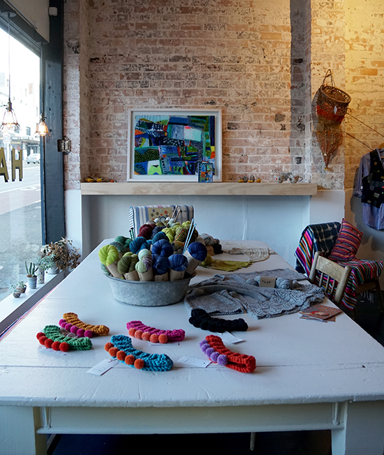
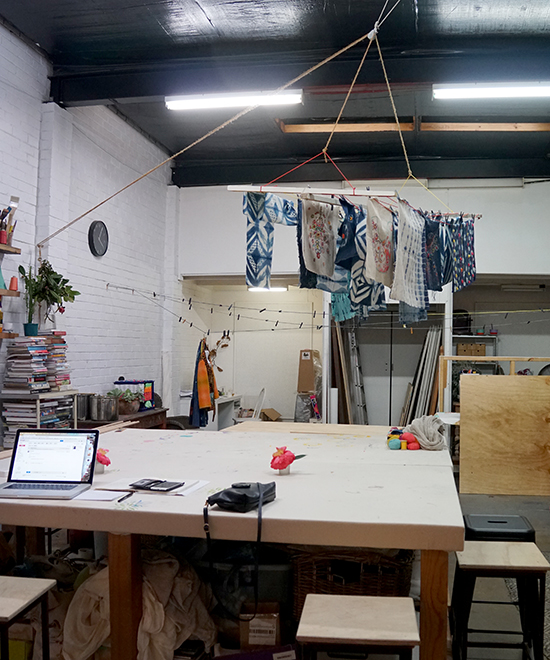
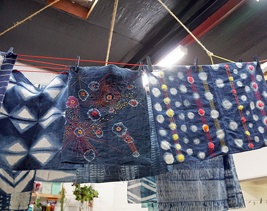
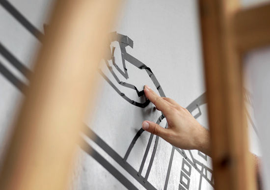
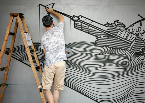
Happily, all is not lost! Master crafter and textile designer, Cath Derksema has relocated the hills hoist to the rear of The Happen Store and is the coolest version of a crafty Aunt you could wish for.  Within the walls of this repurposed old building, makers can hang their hand-made shibori fabric out to dry or display their colourful stitched cushion covers on the clothes line beside those belonging to a new found friend.

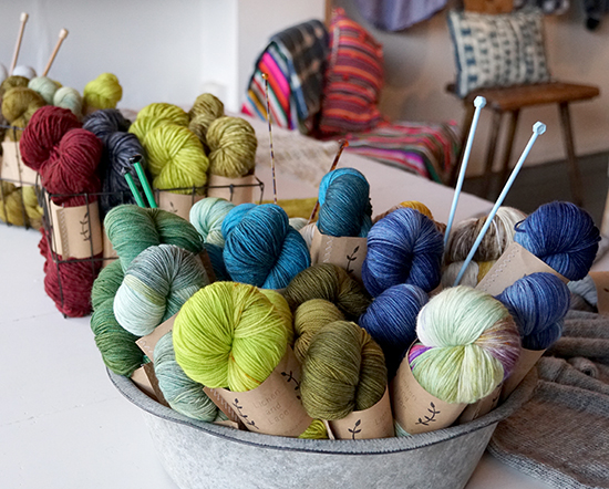
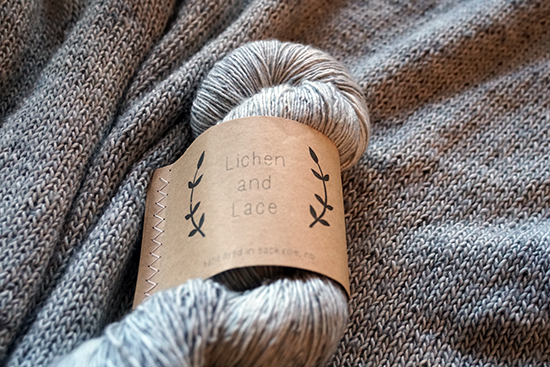
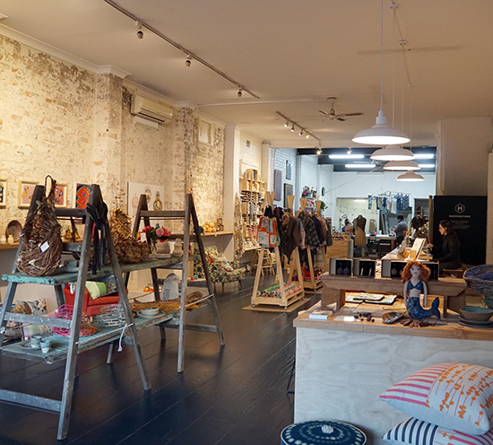
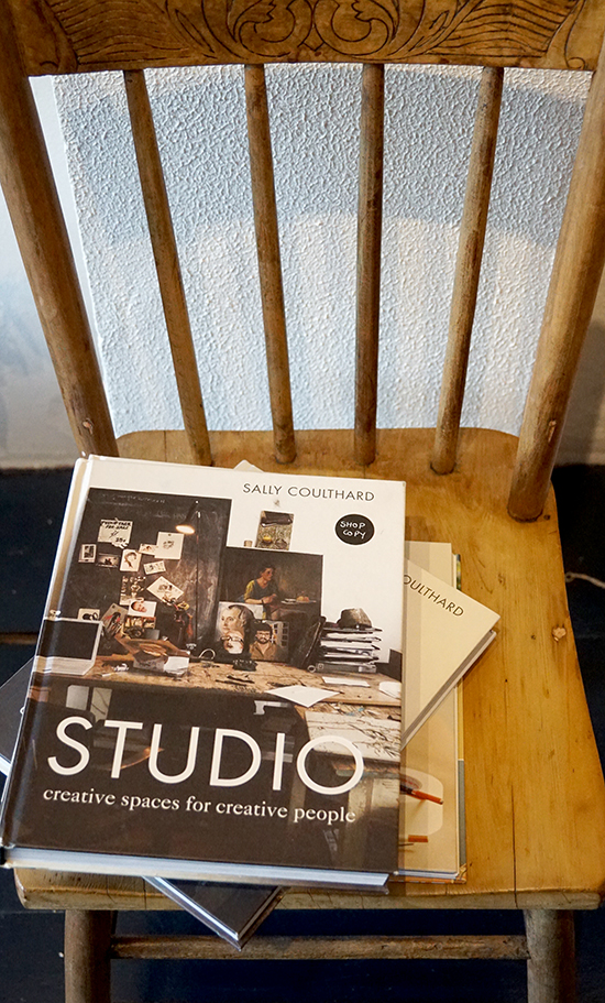
Push open the heavy front door and you are greeted by a range of stunning yarns, Cath's joyfully colourful Prints Charming fabrics, on topic books and a carefully selected range of prints and objects for gifting and home. A champion for 'buy local', all product for sale is exclusively handmade by Australian artists and craftspeople.

It seems to me that Cath has created a modern retail version of 'neighbourhood' where common interests is the connector.

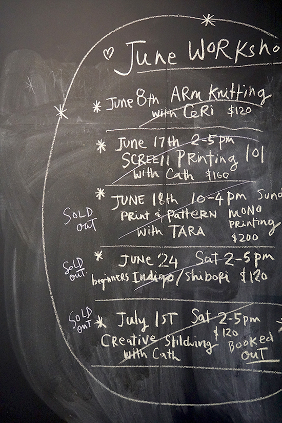
Part shop, gallery, workshop and meeting place, you will find The Happen Store at 55 Parramatta Road Annandale in Sydney.

Tue to Fri 10am–4pm

Sat 12pm–5pm

www.thehappenstore.com  @thehappenstore @printscharmingoriginalfabrics

Botanical Baker

POD_Ivenoven03POD_Ivenoven06POD_Ivenoven10POD_Ivenoven08POD_Ivenoven09POD_Ivenoven02POD_Ivenoven07POD_Ivenoven01POD_Ivenoven05POD_Ivenoven04

You could be forgiven for thinking these baked botanical beauties are actual terrariums. I think they are stunning - just 'wow'. They are even more impressive when you discover they are decorated with buttercream and not fondant icing, and the bakery is based in Indonesia (for the non baker ... buttercream in a hot tropical climate is not a match made in heaven).  You can find this very clever cacti cake maker, Ivenoven, inLippo Karawaci, Jakarta ... or follow the food artist on  instagram.com/ivenoven.

Spotted on designfetish.org

 #PODfinds #pointofdifference

Lab Lines

SONY DSC

This large laboratory inspired window decal for Sensory Lab by St Ali is a stand out moment on Lt Collins Street.  #PODfinds

Oh Porto

POD_Porto_Portugal03POD_Porto_Portugal04POD_Porto_Portugal30POD_Porto_Portugal06POD_Porto_Portugal18POD_Porto_Portugal19POD_Porto_Portugal20POD_Porto_Portugal23POD_Porto_Portugal01POD_Porto_Portugal31POD_Porto_Portugal07 POD_Porto_Portugal08 POD_Porto_Portugal09

Porto is a coastal city in northwest Portugal known for its soaring bridges, Port wine and decorative blue and white tiles that have been a feature of the city's architecture for centuries. In the medieval Ribeira district, narrow cobbled streets wind past merchants’ houses and cafes, medieval relics, majestic bell towers, extravagant baroque churches and stately beaux-arts buildings.

Over the past decade or so Porto has undergone a remarkable renaissance with a new and efficient metro system and notable architectural additions including Rem Koolhaas’ Casa da Música. A popular long weekend getaway for Europeans in search of the sun, the city's graphic identity is a reflection of the increasingly cosmopolitan lifestyle offered by this ancient city.

The words below are from www.atissuejournal.com:

"When it came to designing a graphic identity for the city of Porto in Portugal, one visual symbol wasn’t enough. Porto-based design firm, White Studio, brainstormed what made Porto memorable and unique, and asked people on the street how they viewed the city. No two answers were alike. White Studio concluded, “We felt we needed to give each citizen their own Porto. We needed to show all of the cities that exist in this one territory….It became clear to us that Porto needed to be much more than a single icon, much more than a single logo. It needed complexity. It needed life. It needed stories. It needed personality.”

The designers also needed a way to create a single unified look that would serve as Porto’s one graphic identity. The answer came in the decorative blue ceramic tiles seen throughout the city for centuries. The line drawings and illustrations on the tiles depicted visual stories about Porto’s history, landmarks, and natural surroundings. That inspired White Studio to create 70 pictograms that represented Porto and its people. The pictograms were designed to fit on a grid that could be combined into a network of images or used individually. The logotype itself is a simple blue sans serif against a white background within a blue boxed border. The beauty of this visual system is that it allows elements to be changed out frequently and still be recognizable as Porto’s graphic identity. It works."

Images via www.underconsideration.com and White Studio, Rua Alexandre Braga 94, 1ºEsq.  4000-049 Porto,  Portugal

#PODfinds

Porto--city-of-blue-and-white-tiles-0

Design Porto Portugal
24/05/2015

Half Time

Screenshot 2015-05-17 08.39.46

I have no idea where in the world this 'concrete and clock' installation is located.  Spotted on Flickr, I liked it enough to share it with you.

via www.flickr.com/photos/eam

#PODfinds

Design Other
23/05/2015

Tapping into Some Colour

oil-drum-sink

To March to the Beat of a Different Drum mean to do things in one's own way regardless of societal norms and conventional expectations. This bathroom does that rather well.

Image via www.homedit.com

#PODfinds

Design Other
23/05/2015

A Mighty Fine Line

POD_buff diss tape artist01POD_buff diss tape artist04POD_buff diss tape artist05POD_buff diss tape artist09POD_buff diss tape artist08POD_buff diss tape artist02POD_buff diss tape artist10POD_buff diss tape artist12POD_buff diss tape artist11

Buff Diss is a Melbourne artist who chooses tape as his medium. He has a seriously impressive folio of works from around the world (Hong Kong, Taipai, Berlin and beyond). Wouldn't I love to find a wall or two somewhere on one of my projects for him to work on!  All images via www.buffdiss.com 

Buff Diss Design
26/04/2015

A Tiny Indulgence

Screenshot 2015-04-26 13.25.57Screenshot 2015-04-26 13.25.33Screenshot 2015-04-26 13.23.30Screenshot 2015-04-26 13.20.32

I have to confess to a foodie instagram addiction. I love these cute sugar cookies from a baker called Samantha who lives in Toronto. Simple designs that are  instantly appealing.  @elleventy  pictures via www.instagram.com/elleventy

Design Food Toronto
26/04/2015

A Pop of Pink in Pamplona

OCCIDENS-RPB-46_largeOCCIDENS-RPB-49_largeOCCIDENS-RPB-50_large 
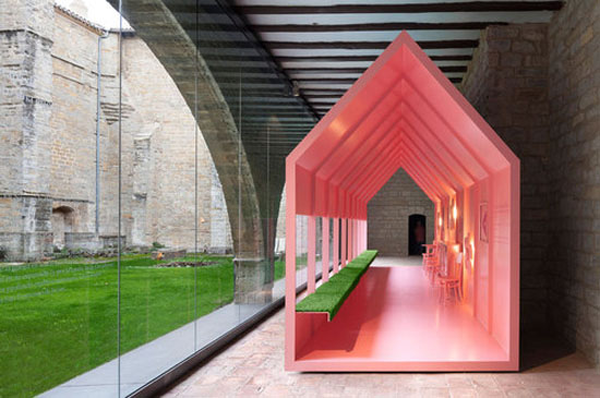
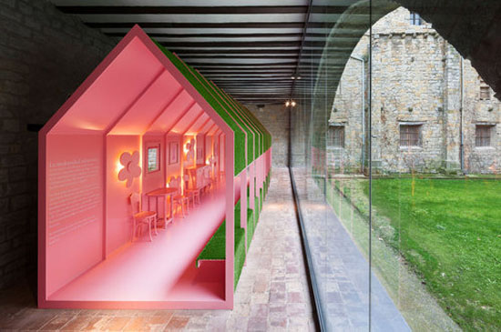
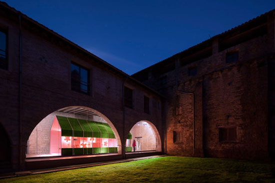
This colourful conclusion to a continuous metal path that runs through the Occidens Museum, housed in the Cathedral of Santa Maria in Pamplona, is certainly unexpected. It makes me want to find out more ... what is the back story to this pink pitched roof structure, and what purpose does it serve?

I like the contrast to the ancient cloisters and connection through greenery, of old to new.  Visually, it stands out.

Standing out is something we in the retail sphere aspire to with every new store design.

Images via architects, Vailloir & Igaray.  

www.vailloirigaray.com/portfolio/occidens-museum

#PODfinds

Design Pamplona
19/04/2015

Ship Shape

MV_Sorrento_Nexus_Designs_01S004_C001_1209U6Est-Magazine-6MV_Sorrento_Nexus_Designs_14Est-Magazine-2MV_Sorrento_Nexus_Designs_10Est-Magazine-5MV_Sorrento_Nexus_Designs_15Est-Magazine-MV_Sorrento_Nexus_Designs_05

Wow ... the Sorrento to Portsea ferry looked nothing like this last time I was on board.

Touted as an ‘experience of nautical discovery and refined coastal tourism’, the newly refurbished MV Sorrento ferry has been given a new lease of life thanks to designers Lucy Marczyk and Sonia Simpfendorfer of Nexus Designs.

Should you find yourself looking to cross Port Philip Bay in southern Victoria, either from the Mornington Peninsula or the Bellarine, then the passenger and vehicle carrying MV Sorrento ferry running between Sorrento and Queenscliff is arguably the most stylish way to now cross the bay.

Referencing the traditional maritime materials of plywood and roping through the use of custom built joinery in beige laminates, pale plywood accents and rope-coiled furnishings paired with custom designed striped Axminister carpets, the Nexus Designs team have created a nautical look that is in keeping with their signature style of classic, understated chic. A perfect way to travel the seas.

Words & Images via the very gorgeous EST Magazine. www.estmagazine.com.au  

Photos by James Geer.

www.nexusdesigns.com.au