Chase the Sun

SONY DSCSONY DSCSONY DSCSONY DSCSONY DSCSONY DSCSONY DSCSONY DSCSONY DSC

As we kick off a new working year I thought I would share a couple of favourite VM projects from 2015. Indulge in a moment of reflection before heading full speed into 2016!

Our challenge for this rather stunning summer fashion campaign was to find an elegant way to showcase a series of wide landscape shots whilst at the same time keeping sight lines to shopfronts 'top of mind' and ensuring the scale was in keeping with the mall.

A pared back palette of marine rope, custom designed 2.4m high white washed ply frames, fisherman's baskets and sea grasses, relaxed chairs and magazine tables came together beautifully for Indooroopilly Shopping Centre's summer magazine promotion.

Thanks again to our client Natalie Kussrow for the opportunity to work with these rather striking images and to POD peeps, Sarah Bowe and Melissa James for their beautiful attention to detail as always (and digging deep to recall their 'Scouting Knots' learn't at 'Brownies').

Concept creative, design, procurement and installation by POD.  #PODfinds

When is a Deli not a Deli?

POD_VM_TMR_201506POD_VM_TMR_201509POD_VM_TMR_201511POD_VM_TMR_201501POD_VM_TMR_201505POD_VM_TMR_201508POD_VM_TMR_201507POD_VM_TMR_201510POD_VM_TMR_201502POD_VM_TMR_201515POD_VM_TMR_201512POD_VM_TMR_201513POD_VM_TMR_201514POD VM TMRPOD_VM_TMR2POD_VM_TMR3

When is a Deli not a Deli?  When it's a fake Deli!  I must admit to being just a tad inspired by Karl Largerfeld for my other favourite POD VM project reflection for the year that has just gone.

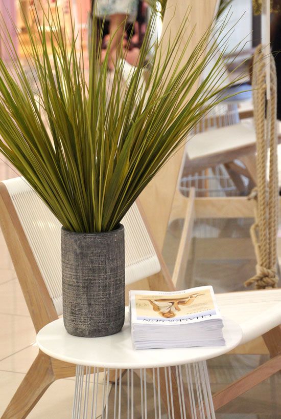
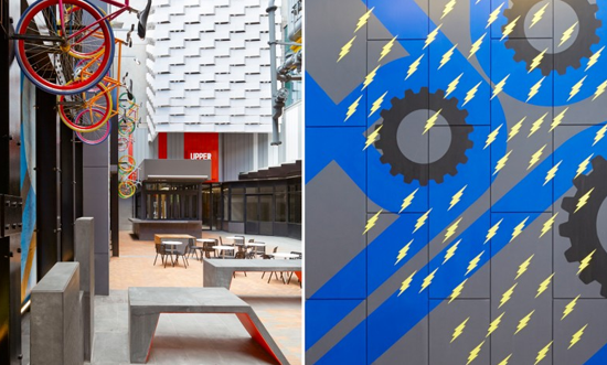
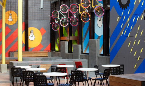
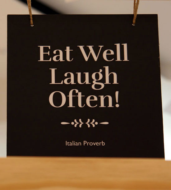
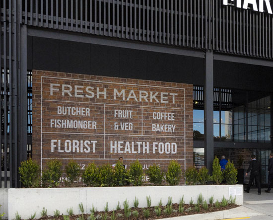
Located within a new fresh food market at Hyperdome Shopping Centre, POD was engaged to turn a vacant tenancy into a temporary space that had to endure for up to 6 months. The brief was that it needed to reflect the contemporary industrial mall architecture and be relevant to market environment; be approachable yet impressive; durable and safe (you know the drill); a dwell space for customers to enjoy ... to sit and read a magazine or make a shopping list, have a coffee or let the kids play.

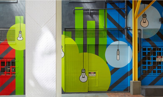
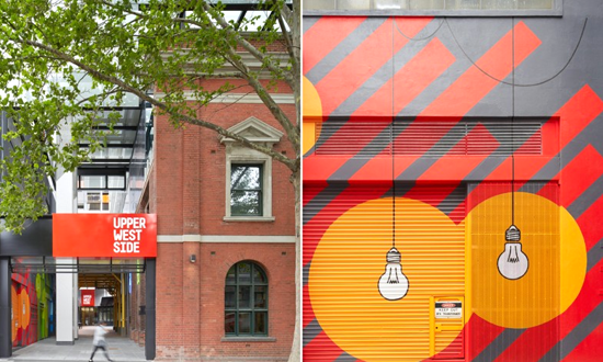
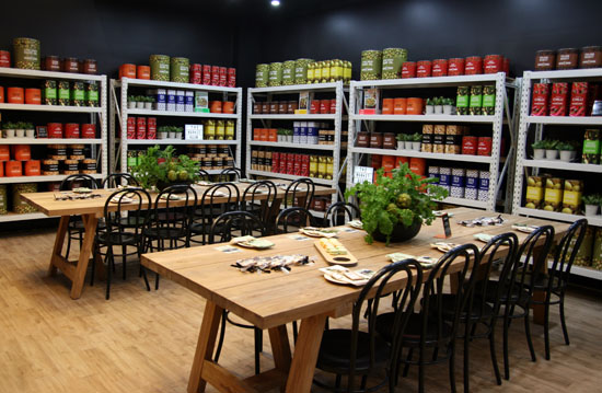
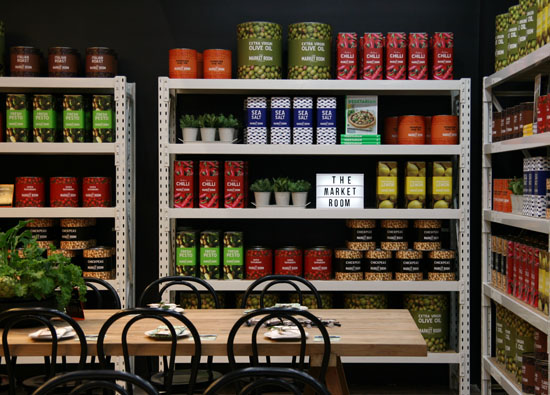
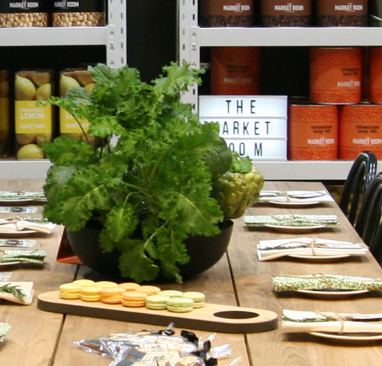
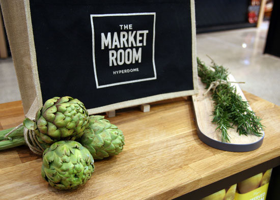
Located in a high traffic area, just inside a new entry door to The Market Room, and opposite a large Fruit & Vegetable kiosk that oozed colour and character, POD created a 'Deli' space that was "colourful enough" to compete with the fruit and vegetable displays so that it too got noticed; that was interesting and inviting; and promoted The Market Room brand at every touch point.

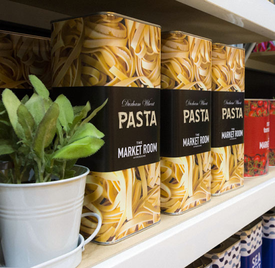
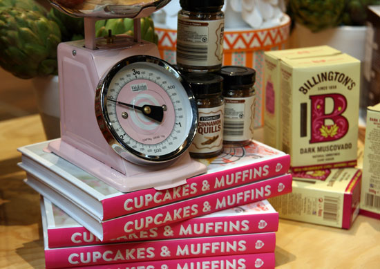
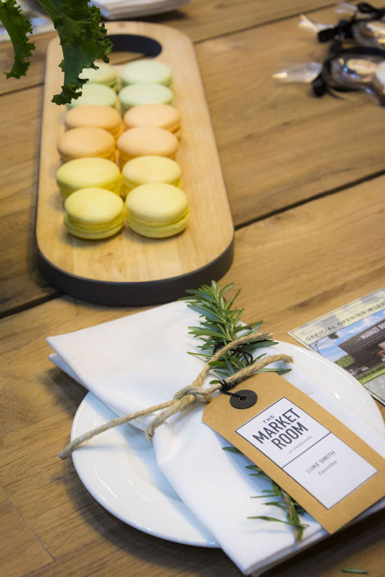
From a logistics perspective, three very large pallets of tins took three very dedicated POD peeps just on three days to transform them into The Market Room olives, tomatoes, coffee beans, pasta, gourmet sea salt, preserved lemons and more. The final effect was worth the miles and miles of double sided tape (and somewhat monotonous process) to stock the pop up 'shop' space!

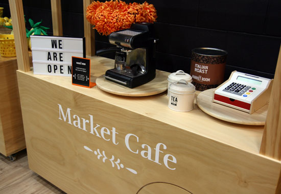
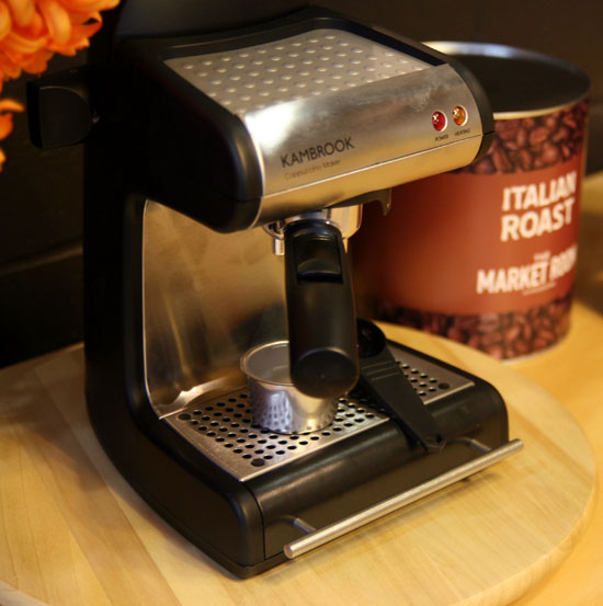
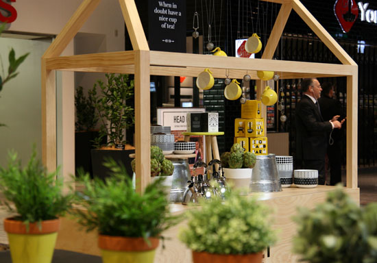
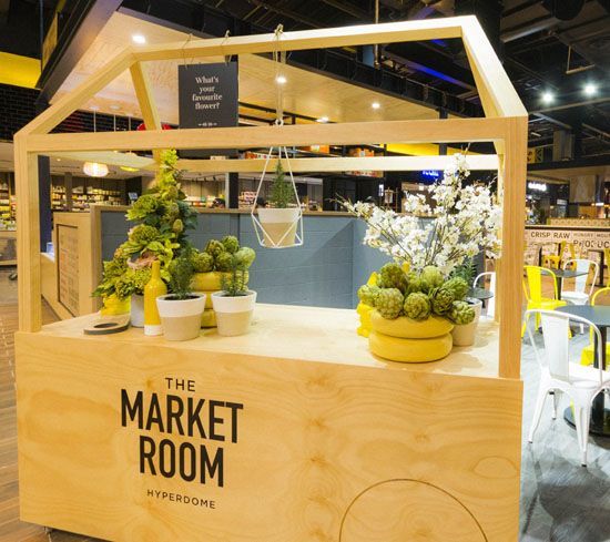
Three mini 'counters' for small children to "play shop", whilst 'big people' enjoyed a coffee at the communal tables, were themed as Hipsta Florista, Bambini Bakery and Market Cafe.  These super cute carts gave kids the chance to make their own 'babycinos' and whip up all sorts of goodies in the bakery or water the flower pots.  As a connecting message to the long established existing centre, POD peeps designed and delivered 6 contemporary carts merchandised with various food or floral themes to showcase the new retailers and their produce,  a 'story of taste temptations' if you like, as the lead in from the old mall to the new.

Creative concept, design, graphics, procurement and installation all by POD with special thanks to my Brisbane based VM, the talented Sarah Bowe, and our super client, Hayley Coote.

#PODfinds

The Market Room VM
04/01/2016

POD Peeps A Planting

POD_VM_TrangViet_SBowe04POD_VM_TrangViet_SBowe30POD_VM_TrangViet_SBowe25POD_VM_TrangViet_SBowe35POD_VM_TrangViet_SBowe10

It's not often we give POD a plug but I loved the result of this 'work in progress' so much I thought I would share it now.

My talented team of merchandisers spent 3 days in the most amazing empty warehouse converting chicken coops and artificial greenery into these stunning hanging baskets. Measuring 1m wide and 1.5m long, they will be installed in a new Vietnamese cafe later this week. Thanks to our client Natasha and designer, David Cuschieri at cuschieridesign.com, for the opportunity to create these botanical beauties!

Big shout out to Sarah, Melissa, Kate and Ali for their wonderful work, we can't wait to see them insitu.  Thanks for the moody warehouse pics goes to my Brissy based 'right hand woman' Sarah Bowe.

instagram.com/sarah_bowe 

#PODfinds

POD VM VM Brisbane
22/11/2015

Scroll Down

SONY DSCSONY DSCSONY DSCSONY DSCSONY DSC

Cruffins, Cronuts, Bronuts, Donuts and Scrolls are the hottest things around despite the gluten free & 'I quit sugar' army of followers growing in numbers daily.  Eat a Scroll is a pop up on the increasingly gentrified Smith Street, Collingwood.  It's a bit 'make shift' and grungy which is perfect for the location. The logo caught my eye first (I like it) followed by the quirky, clever message on the footpath A-frame which made it mandatory that I stepped inside for a lookie see.  I didn't sample the fare so can't say if the product matches the promise.

#PODfinds

Lab Lines

SONY DSC

This large laboratory inspired window decal for Sensory Lab by St Ali is a stand out moment on Lt Collins Street.  #PODfinds

Closure

SONY DSC

Sometimes in life you just need closure. This door does it for me. You can find Clement Coffee Roasters at South Melbourne Market where they peddle good caffeine and donuts just a few doors up from those famous dim sims.  #PODfinds

Oh Porto

POD_Porto_Portugal03POD_Porto_Portugal04POD_Porto_Portugal30POD_Porto_Portugal06POD_Porto_Portugal18POD_Porto_Portugal19POD_Porto_Portugal20POD_Porto_Portugal23POD_Porto_Portugal01POD_Porto_Portugal31POD_Porto_Portugal07 POD_Porto_Portugal08 POD_Porto_Portugal09

Porto is a coastal city in northwest Portugal known for its soaring bridges, Port wine and decorative blue and white tiles that have been a feature of the city's architecture for centuries. In the medieval Ribeira district, narrow cobbled streets wind past merchants’ houses and cafes, medieval relics, majestic bell towers, extravagant baroque churches and stately beaux-arts buildings.

Over the past decade or so Porto has undergone a remarkable renaissance with a new and efficient metro system and notable architectural additions including Rem Koolhaas’ Casa da Música. A popular long weekend getaway for Europeans in search of the sun, the city's graphic identity is a reflection of the increasingly cosmopolitan lifestyle offered by this ancient city.

The words below are from www.atissuejournal.com:

"When it came to designing a graphic identity for the city of Porto in Portugal, one visual symbol wasn’t enough. Porto-based design firm, White Studio, brainstormed what made Porto memorable and unique, and asked people on the street how they viewed the city. No two answers were alike. White Studio concluded, “We felt we needed to give each citizen their own Porto. We needed to show all of the cities that exist in this one territory….It became clear to us that Porto needed to be much more than a single icon, much more than a single logo. It needed complexity. It needed life. It needed stories. It needed personality.”

The designers also needed a way to create a single unified look that would serve as Porto’s one graphic identity. The answer came in the decorative blue ceramic tiles seen throughout the city for centuries. The line drawings and illustrations on the tiles depicted visual stories about Porto’s history, landmarks, and natural surroundings. That inspired White Studio to create 70 pictograms that represented Porto and its people. The pictograms were designed to fit on a grid that could be combined into a network of images or used individually. The logotype itself is a simple blue sans serif against a white background within a blue boxed border. The beauty of this visual system is that it allows elements to be changed out frequently and still be recognizable as Porto’s graphic identity. It works."

Images via www.underconsideration.com and White Studio, Rua Alexandre Braga 94, 1ºEsq.  4000-049 Porto,  Portugal

#PODfinds

Porto--city-of-blue-and-white-tiles-0

Design Porto Portugal
24/05/2015

Half Time

Screenshot 2015-05-17 08.39.46

I have no idea where in the world this 'concrete and clock' installation is located.  Spotted on Flickr, I liked it enough to share it with you.

via www.flickr.com/photos/eam

#PODfinds

Design Other
23/05/2015

Tapping into Some Colour

oil-drum-sink

To March to the Beat of a Different Drum mean to do things in one's own way regardless of societal norms and conventional expectations. This bathroom does that rather well.

Image via www.homedit.com

#PODfinds

Design Other
23/05/2015

Brilliant Light Bulb Moment

POD_MimDesign_UpperWestSide01POD_MimDesign_UpperWestSide02POD_MimDesign_UpperWestSide06POD_MimDesign_UpperWestSide04POD_MimDesign_UpperWestSide03POD_MimDesign_UpperWestSide05POD_MimDesign_UpperWestSide07POD_MimDesign_UpperWestSide08POD_MimDesign_UpperWestSide11POD_MimDesign_UpperWestSide10POD_MimDesign_UpperWestSide09

High rise apartment blocks continue to sprout all over Melbourne's city scape. Some developers do them well, others not.

POD is a long time fan of the work of Mim Design and their Upper West Side project is no exception. Working with Latitude and Diadem on design and delivery, this playful communication celebrates the sites old power station heritage and appeals the youthful lifestyle that now lives within.

Images via www.mimdesign.com.au

www.diadem.com.au and www.latitudegroup.com.au

#PODfinds