Fresh from Rotterdam

mvrdv market2 mvrdv market3mvrdv market4mvrdv market6MVRDV-Markthal-Rotterdam-Hufton-Crow_dezeen_468_9mvrdv market5mvrdv market7mvrdv market1MVRDV-Markthal-Rotterdam-Hufton-Crow_dezeen_468_25

Wow, whether you love it or loath it there is no ignoring the new Markthal Rotterdam!

Designed by MVRDV, the Netherlands' first covered market shelters beneath a 40-metre arch that contains 228 apartments and is protected by glazed end walls which frame the super colourful mural by artists Arno Coenen and Iris Roskam.

Printed onto perforated aluminium panels, which line the one-hectare surface beneath the arch, the mural displays images of flowers and insects derived from 17th century Dutch paintings.

The UK's Guardian critic Oliver Wainwright has described it as "a Sistine chapel of fresh produce  ...  it squats like a chubby elephantine creature, lined with windows and balconies along its 120 metre-long flanks, terminating in a gaping portal towards the square like Milan's galleria, opening up to suck you into its psychedelic tunnel".

Speaking to Dezeen in Rotterdam just before construction was completed, architect Winy Maas explained that the building's unusual shape came about because he thought the initial scheme proposed by the developer was "boring". "In the beginning they wanted to have two slabs of houses, with a sort of market in between... so you get a U-shaped volume," he said. "I said "that's boring. Why don't we twist it?'" The new form provided more penthouses, a structurally simple arch and plenty of retail units on the ground floor, so the client gave the go-ahead.

MVRDV apt viewMVRDV ceilingMVRDV penthouse

Internal windows in the apartments provide residents with views of the market below, while shoppers can glimpse the people above. "Every house has a window that look into the hall," said Maas. "When you're in the market hall you see urban life. When you go up where the windows are flat you can see people walking over the windows looking down."

Words and images above Via Dezeen.

No matter what your personal opinion might be, this architecture is no doubt a defining landmark in Rotterdam. There is definitely no ignoring the 'elephant' in the square or city for that matter. I love Oliver Wainwright's view on this 'hard to ignore' new structure which you can read here:

http://www.theguardian.com/artanddesign/architecture-design-blog/2014/oct/02/-sp-rotterdam-markthal-superdutch-market-mvrdv

Red’s B&W Greenhouse

POD Val Red 3POD Val Red 2POD Val Red_Florence Valentino Red's fashionable greenhouse popped up a couple of years back. I still like it so thought I'd share it! #popup #valentinored #florence

Australia’s Hot Restaurants 2014

This article appeared in today's edition of The Australian.  POD presented at the Property Council of Australia conference in WA a couple of months ago on Food & Design trends. This article supports the comments I made then on the trend to 'convergence in the middle'  ... it's good to know these highly respected food journos are of the same opinion!

HOT 50 RESTAURANTS OF 2014: EMERGING TRENDS by John Lethlean and Necia Wilden

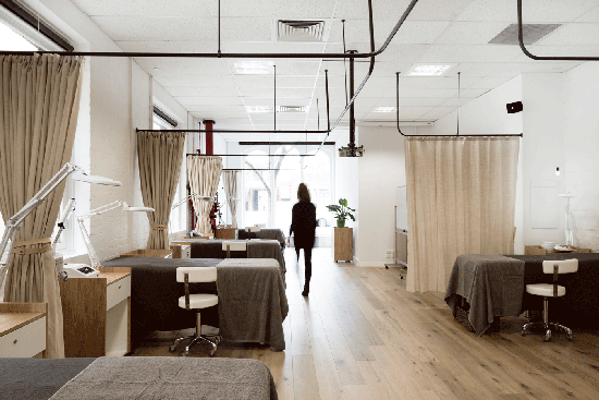
Author Michael Symons called it “one continuous picnic”, and we reckon that’s a nice summation of the state of dining out in Australia today. It’s increasingly informal. It’s very democratic. It’s all about sharing. It can happen any time of day. It can be fast and furious, or languid (and liquid). The restaurant experience in Oz has never been closer to the posh picnic.

It’s almost a metaphor for Australian society: there has been a convergence somewhere around the middle. Price-wise, lower-end places have moved up by a sometimes surprising degree, usually by stealth. And higher-end dining rooms have scrambled to make themselves look and feel more accessible and affordable. The fact is, dinner out at anywhere half-decent is going to cost you $100 a head, at least, no matter how hard your chosen restaurant may pitch the Gen Y message.

And increasingly, it’s all about your thirst. The need for restaurateurs to profit from beverage sales, particularly wines and cocktails, has never been clearer, yet it seems that if they get the spirit – and the space – right, we are all too willing to pay. There are queues, and waiting lists, to prove it.

There’s another kind of convergence we’ve noticed, too. At the elite end of the dining spectrum our most expensive restaurants are, by international standards, good value for money, like this year’s Hottest Restaurant (and Hottest in NSW), Rockpool. In the middle, however, the consensus from visitors is that Australia is a pricey place for a casual bite.

Top restaurant trends

We can’t help but be enthused about the dining scene in Adelaide. A new spirit is creeping through the city, with small bars, wine bars and food bars popping up. Compared with the rest of Australia, they offer excellent value for money. It’s no mistake that our winner of this year’s Hottest Value gong is North Adelaide’s nose-to-tail mecca The Daniel O’Connell. It’s exceptional, but let’s not forget this is a city with a history of gastronomic trailblazing and we’d love to think the glory days of the ’80s are coming back.

It’s tempting to say the biggest trend in restaurants this year is wine bars. Everywhere you look, some of the smartest sommeliers and wine geeks are plying their trade in cosy, comfy, good food-oriented bars. It’s driven by the wine price model in restaurants, our love of small-plate nibbles and our appetite for what’s new and provocative in wine.

Wine mark-ups. Doing the retail comparison will only give you heartburn. At a certain type of city restaurant, it seems that anything drinkable needs a $50 mark-up over bottle shop prices to earn a place on the wine list. The era of the $45 starting point for the simplest of wines is here, whether we like it or not.

America, hell yeah. Whatever did we do before discovering the USA last year? Sliders, brisket, ribs, burgers, dogs, po’boys… and not just at the shake-and-bake price point either. The US thing – and its kissing cousin, street food – has permeated the kitchens of some of our most serious chefs. It’s part of the picnic theory: this is a very convivial, egalitarian way to eat and, done well, it’s a joy.

Korea, where have you been? Once, each city had a smattering of trad Korean dining rooms where expats and the curious would venture. Now, alongside them is a new wave of diner that references Seoul. We’re all so familiar with the hot/sour/salty/sweet flavour palette of Southeast Asia: it was time for a whole new layer from the funk and mystery of fermentation. Hello, kimchi; welcome gochujang.

Smoking, coal and wood burning, pickling, foraging, fermenting, producing honey, curing fish: all gathering momentum.

House-made… bread (has never been better); butter (ditto); and fresh curds, including tofu. Mind you, some restaurants aren’t providing bread at all, unless you pay. They shoot themselves in the foot.

Dashi, coastal succulents and native ingredients have invaded our plates, mostly for the better.

Ingredients you cannot avoid these days: yuzu, buttermilk, kale, smoked eel, quinoa, sea urchin, miso.

Dining has gone digital. Whether it’s booking systems, payment methods or the ever-deepening penetration of social media at the table, that smartphone in your pocket is an essential dining companion.

Yes, Australian restaurants have issues. But after sampling international restaurants and with the anecdotal feedback of visitors, we can say dining in Oz – led invariably by broad-minded, well-travelled chefs – is in exciting shape. In the words of too many waiters: please enjoy.

Story via www.theaustralian.com.au/executive-living/food-drink

#podfinds #foodtrends #dining #australia #2014
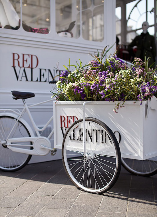
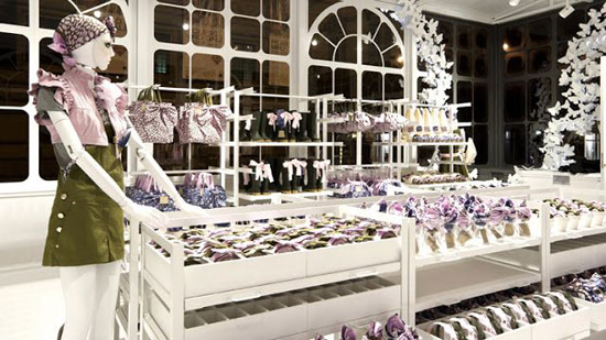
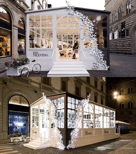
Food
07/10/2014

Chalk it up to experience

Chalk-Mural-by-Ben-Johnston-2 Chalk-Mural-by-Ben-Johnston-1 Chalk-Mural-by-Ben-Johnston-5 Chalk-Mural-by-Ben-Johnston-14 Chalk-Mural-by-Ben-Johnston-13 Chalk-Mural-by-Ben-Johnston-8 Chalk-Mural-by-Ben-Johnston-7 Chalk-Mural-by-Ben-Johnston-4 Chalk-Mural-by-Ben-Johnston-17 Chalk-Mural-by-Ben-Johnston-12 Chalk-Mural-by-Ben-Johnston-10

To "chalk something up" is to attribute it. When we "chalk something up to experience", we’re saying that although it wasn’t the outcome we wanted, we can at least learn from the experience. The phrase originated with the custom of marking bar tabs and scores on a slate in pubs.

Given the pub/bar tab historical reference I thought it an apt title for this blog post (although I suspect the outcome on this one well exceeded the client's expectation).

Ben Johnston is a Toronto based graphic artist commissioned by the Sierra Nevada brewery in Nth Carolina to illustrate their brewing story.

WOW is what I have to say about Ben's work. Chalk art has been trending for a while now and this is one of the best applications I've seen.  3 weeks in the making and approx 160 sq metres, you can find more of  Ben's amazing work at www.benjohnston.ca

All images with thanks via benjohnston.ca  

#podfinds #chalkart #installation #design

Ben Johnston Design VM Food
05/10/2014

Learning from Techne

Beauty-EDU_04 Beauty-EDU_01 Beauty-EDU_02 Beauty-EDU_08 Beauty-EDU_03 Beauty-EDU_05 Beauty-EDU_07

Melbourne is home to some stand out design firms (and yes, I appreciate there is no news in that statement).  Seemingly every time some clever design fabulousness crosses my desk these days it is the work of  Techne Architects + Interior Design.  I have to admit I am a touch smitten with their residential and retail work in particular.

For me, one of the immediate outcomes of good retail design should be trust. It makes you want to step inside and, once in the door, you immediately feel like the space and staff know its purpose and the service and product is going to be good. It sets the tone for the brand positioning and price point. The space says you can trust your instincts that this is something that will appeal to who you are as a person. First impression tells me Beauty EDU is a modern beauty bar / spa / salon.  It is, but for those still learning the ropes of the pampering trade!

I don't have much experience with beauty training schools but if I scratch around in my memory vault I recall with great hilarity the worst haircut I have ever seen (many years ago a gal pal, trying to save a few pennies, went and got a cut & colour by a student at a "hairdressing academy" that I hope is no longer in business). I always imagined such establishments to have crap fluorescent lighting, chipped paint on the walls and 'oops missed' blobs of wax stuck in places where it shouldn't be. The sort of establishment where you feel nervous for your eyebrows or toenails before they've let the inexperienced lay a finger on you.

Beauty EDU turns the idea of, what I imagined, a training school looks like completely on its head. Here is how Techne describe it:

"With the concept of offering a new approach to practicing beauty therapy in mind, the aim was to create a retail environment that was simple, clean and unlike anything else on the market. The reception area is the main attraction in the Beauty EDU fitout. This area is the hub of the space, with a large desk for clients to perch at with copper and timber detailing. From the reception space, there are views into treatment, meeting and classroom areas, giving a sense of what is happening behind the scenes. White washed timber and accents of mint are used throughout the space, to tie in with the Beauty EDU brand. The finished result is a space that provides a professional environment and sets the tone of the high standards of the school. And of course a space where the students will enjoy coming to learn."  #techne #beautyedu #gooddesign #podfinds

Images and quote via techne.com.au.  

You can find the talented Techne team at L2, 34 Hardware Lane Melbourne. Photography by Tom Blachford

Magic Carpet

brussels-flower-carpet

This stunning carpet measures 25m x 75m and is made from thousands of fresh Belgian Begonias. Until I stumbled upon this striking installation I did not know that Belgium cultivates 60 million begonia tubers every year, and is recognized as the world’s largest producer.

The Flower Carpet appears in Brussel's main square every 2 years. 2014's dramatic design is inspired by the Turkish Kilm (pic below).

flower carpet 2014

It's times like this that I wished I lived in Europe and could easily hop on a train to experience such fabulousness!  via www.flowercarpet.bet

VM Other Belgium
17/08/2014

Hola Hermes

POD_Hermes_Barcelona

How fabulous is the work of French studio zim & zou?! This wonderful window was created for the Hermès store in paseo de gracià, Barcelona.

The intricately folded and vibrantly colored paper and leather installation was made entirely by hand. The orange-and-blue-hued scene tells the story of a small fox who inhabits the space with his own personal objects, giving a glimpse into his quirks and personality. ‘the fox’s den’ is completed with furniture and household objects all made of paper, from the table and stool he sits on to the assemblage of photos hanging on the floral-patterned wall.

Hermès accessories such as ties, scarves and shoes are placed throughout the dwelling, uniting the fashion label’s wearable designs and the delicate and complex papercraft work.

Reposted with thanks from DesignBoom.

Hermes VM Barcelona
15/08/2014

White & Light

pod_fleur_xmas window2013 
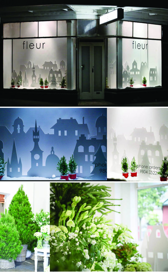
I loved the simplicity and night lighting effect of Fleur's Christmas windows this festive season. Inside it was all fresh green and white topped off with the wonderful smell of pine trees.  You can find Fleur and her fabulous flowers in Rose Street, Armadale, Melbourne.

Fleur VM Melbourne
06/01/2014

Oh Deer!

POD_SW_HM_Xmas13 
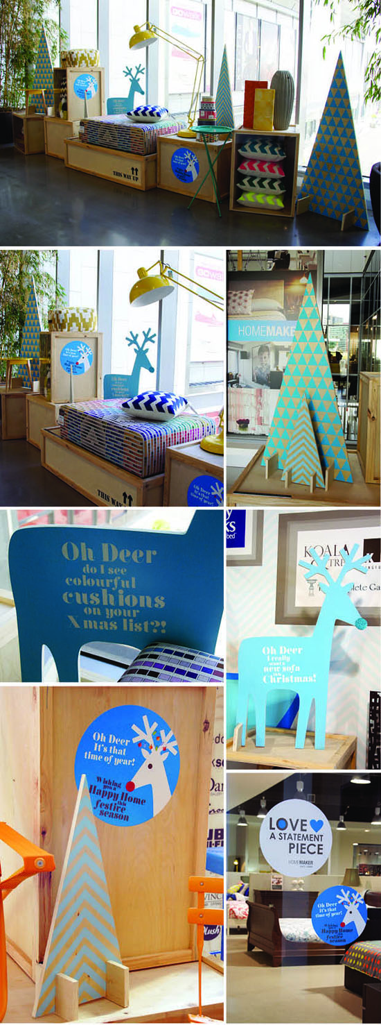
With Christmas only a fortnight away and spending about to ramp up a notch or 10, these super cute ply trees and mini reindeers were added to the South Wharf Homemaker VM campaign POD designed and installed back in October. Reinforcing the 'directional blue arrow' for the new in-centre signage and coordinating with the industrial look shipping crates, both the POD Peeps and our lovely client, Jess Harney, think they have come up a treat!  "Oh Deer, it's that time of year' creative, design and install by POD with super assistance by @Comer&King.   #homemakerSW  #statementpiece  #christmasdecs  @podfinds

Pantone Purple

POD_pantone2014

Pantone has announced #RadiantOrchid is the colour for 2014.  Just a week ago I decorated my Christmas tree with bouganvillea from the garden in this exact shade (who knew I was so on trend?!).  It dries off to a paler pinky paper type texture. According to Pantone the colour emanates "great joy, love and health" - the perfect positioning statement for Christmas!

#pantonecolouroftheyear #pantone #podfinds #pointofdifference

Pantone 2014 VM
09/12/2013