Search Results for 'cafe'

Simply French

pod_entrecote_sthyarra_blog

Paris is Jason McLaren Jones favourite ‘go to’ city when looking for inspiration for a new cafe (he’s delivered quite a few over the past 8 years). Entrecote on Domain Road South Yarra captures the euro mood perfectly. I love the simple signage directive showing the way to take away pastries and and coffee … well deserved once you’re circled the Tan.

entrecote.com.au @entrecotemelbourne  #simplyfrench #melbournecafes

Entrecote Food Melbourne
September 10, 2016 Comments (0)

Thai Take on Providore

SONY DSCSONY DSCSONY DSCSONY DSCSONY DSCSONY DSCSONY DSCSONY DSCSONY DSCSONY DSCSONY DSCSONY DSCSONY DSCSONY DSC

Amy Chanta came to Australia with $300 in her pocket and the dream of a  better life for her 2 small children. Fast forward around 30 years and her story is the epitome of ‘migrant makes good’ achieved through hard work, persistence and serving up damn good Thai food.

I first stumbled across Amy’s food in her Haymarket Chat Thai cafe which, at the time, caught my eye for a variety of reasons whilst wandering through Sydney’s Chinatown  … a queue on the street waiting for a table, a modern yellow logo on the shop front, an open kitchen with well presented staff cooking fresh food to order.  It was a stand out from the tired, traditional, slightly jaded and faded outlets in the neighbourhood.

Boon Cafe is her most recent venture albeit around 12 months old.  It combines Asian grocery with a cafe that offers a Thai twist on ‘all day cafe’ fare. For readers who know Sourced Grocer in Brisbane, Boon Cafe is pretty much the Thai/Asian version when it comes to the format.

I’ve visited plenty of Asian grocery shops around the country but have not seen anything like Boon with its ‘now’ design and cafe inclusion.  There is a cool room abundant with fresh Asian herbs, fruits and vegetables … dragonfruit, banana blossom, tiny Thai eggplant, fresh ginger and tumeric, pre-packed fresh ingredients to make your own Tom Yum soup etc.  If you’re not with me, it’s sort of the equivalent of a cheese room in a European style deli if you like.

Open 7am to midnight, my experience was an early evening casual bite after a working day but I’m curious to find out more, so Boon is on my list for breakfast or lunch next time I’m in Sydney as there is plenty on the Thai inspired “modern cafe” hybrid menu that seems worthy of a tasting trip.

#PODfinds   @boon_cafe #booncafe #jarernthaigrocer

Jarern Thai Asian Grocer and Boon Cafe, 425 Pitt Street, Sydney 

Thin Blue Lines

POD_Marianne Hallberg11POD_Marianne Hallberg07POD_Marianne Hallberg04POD_Marianne Hallberg09POD_Marianne Hallberg02POD_Marianne Hallberg03POD_Marianne Hallberg01

Regular readers will know I have a hankering for ceramic drawings (or hand drawn ceramics) having featured the work of UK ceramicist, Katharine Morling, in a previous post. The domestic simplicity of Swedish artist Marianne Hallberg’s object topic has a charm all of its own. I would love a brief that allowed me to use her work in a cafe design (oh for a budget that includes an artist!). The tea towel is my favourite piece.

#PODfinds

Images via mariannehallberg.se & themudbucket.blogspot.com.au.

POD Peeps A Planting

POD_VM_TrangViet_SBowe04POD_VM_TrangViet_SBowe30POD_VM_TrangViet_SBowe25POD_VM_TrangViet_SBowe35POD_VM_TrangViet_SBowe10

It’s not often we give POD a plug but I loved the result of this ‘work in progress’ so much I thought I would share it now.

My talented team of merchandisers spent 3 days in the most amazing empty warehouse converting chicken coops and artificial greenery into these stunning hanging baskets. Measuring 1m wide and 1.5m long, they will be installed in a new Vietnamese cafe later this week. Thanks to our client Natasha and designer, David Cuschieri at cuschieridesign.com, for the opportunity to create these botanical beauties!

Big shout out to Sarah, Melissa, Kate and Ali for their wonderful work, we can’t wait to see them insitu.  Thanks for the moody warehouse pics goes to my Brissy based ‘right hand woman’ Sarah Bowe.

instagram.com/sarah_bowe 

#PODfinds

POD VM VM Brisbane
November 22, 2015 Comments (0)

Oh Porto

POD_Porto_Portugal03POD_Porto_Portugal04POD_Porto_Portugal30POD_Porto_Portugal06POD_Porto_Portugal18POD_Porto_Portugal19POD_Porto_Portugal20POD_Porto_Portugal23POD_Porto_Portugal01POD_Porto_Portugal31POD_Porto_Portugal07 POD_Porto_Portugal08 POD_Porto_Portugal09

Porto is a coastal city in northwest Portugal known for its soaring bridges, Port wine and decorative blue and white tiles that have been a feature of the city’s architecture for centuries. In the medieval Ribeira district, narrow cobbled streets wind past merchants’ houses and cafes, medieval relics, majestic bell towers, extravagant baroque churches and stately beaux-arts buildings.

Over the past decade or so Porto has undergone a remarkable renaissance with a new and efficient metro system and notable architectural additions including Rem Koolhaas’ Casa da Música. A popular long weekend getaway for Europeans in search of the sun, the city’s graphic identity is a reflection of the increasingly cosmopolitan lifestyle offered by this ancient city.

The words below are from www.atissuejournal.com:

“When it came to designing a graphic identity for the city of Porto in Portugal, one visual symbol wasn’t enough. Porto-based design firm, White Studio, brainstormed what made Porto memorable and unique, and asked people on the street how they viewed the city. No two answers were alike. White Studio concluded, “We felt we needed to give each citizen their own Porto. We needed to show all of the cities that exist in this one territory….It became clear to us that Porto needed to be much more than a single icon, much more than a single logo. It needed complexity. It needed life. It needed stories. It needed personality.”

The designers also needed a way to create a single unified look that would serve as Porto’s one graphic identity. The answer came in the decorative blue ceramic tiles seen throughout the city for centuries. The line drawings and illustrations on the tiles depicted visual stories about Porto’s history, landmarks, and natural surroundings. That inspired White Studio to create 70 pictograms that represented Porto and its people. The pictograms were designed to fit on a grid that could be combined into a network of images or used individually. The logotype itself is a simple blue sans serif against a white background within a blue boxed border. The beauty of this visual system is that it allows elements to be changed out frequently and still be recognizable as Porto’s graphic identity. It works.”

Images via www.underconsideration.com and White Studio, Rua Alexandre Braga 94, 1ºEsq.  4000-049 Porto,  Portugal

#PODfinds

Porto--city-of-blue-and-white-tiles-0

Curb appeal

POD Daylesford Org Victoria
Daylesford Organics (not to be confused with the posh ‘all white and oak’ London noshery) is a farm north of Melbourne. Certified organic, they focus on sustainability and biodiversity and produce up to 40 varieties of apples a season, hazelnuts, berries, free range eggs and vegetables. Heirloom varieties with lots of different flavours and colours are a speciality. Selling their quality produce to local cafés, restaurants and through farmer’s markets, you can also collect a just picked apple via their super cute roadside stall.

#PODfinds

Made in Manhattan

POD_twohands nyc4POD_twohands nyc8POD_twohands nyc6POD_twohands nyc3POD_twohands nyc5POD_twohands nyc2POD_twohands nyc7POD_twohands nyc1

I’m researching for a trip to NYC and USA later this year.  Pleased to report that a couple of Sydney lads, Giles Russell and Henry Roberts, are making their mark in Manhattan and bringing that relaxed Australian cafe style, and good coffee, to the city that never sleeps. Love the look of Two Hands (it’s definitely on the list). These gorgeous images are by photographer Josephine Rozman and sourced via www.twohands.com  

Two Hands, 164 Mott Street, NYC, New York.

#PODfinds

Take a drive down Beach Road

GT_CR_POD blog4GT_CR_POD blog1GT_CR_POD blog2GT_CR_POD blog3

Earlier this week I was super impressed with the swish new look for the Sorrento to Queenscliff ferry. A few paces away from the water front and I discover there is a gorgeous new look Country Road store housed in the town’s old post office, a rustic red-brick building built back in 1905. Celebrating it’s 41st year, Country Road is the perfect positioning for the chi chi Sorrento set.  Naturally no lifestyle brand is complete without a cafe these days and Post 3943  taps into the coffee and casual dining trend. Operated by local organic specialists The Sisters, this ‘resort / lifestyle’ format will no doubt win huge favour with the locals for all its fabulousness!  Photos via Country Road Instagram.

Retail ‘Hip’ discovered in ‘Ip’ (who knew?!)

POD_ESTraders_Ipswich

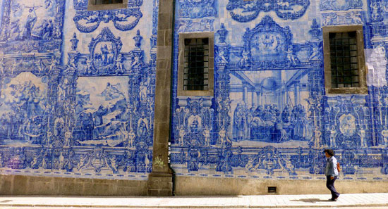
If taking a day trip out of Brisbane I assume most people, as a general rule, head North or South. Last Wednesday I headed West. Upon announcing to anyone who would listen that I was “off to Ipswich” I was met with a similar range of reactions (rolling eyeballs, “WTF?” and “AYKM?!” being the most common response) but, being an optimist and relatively new to this part of the world, I shrugged it off and went on my way.

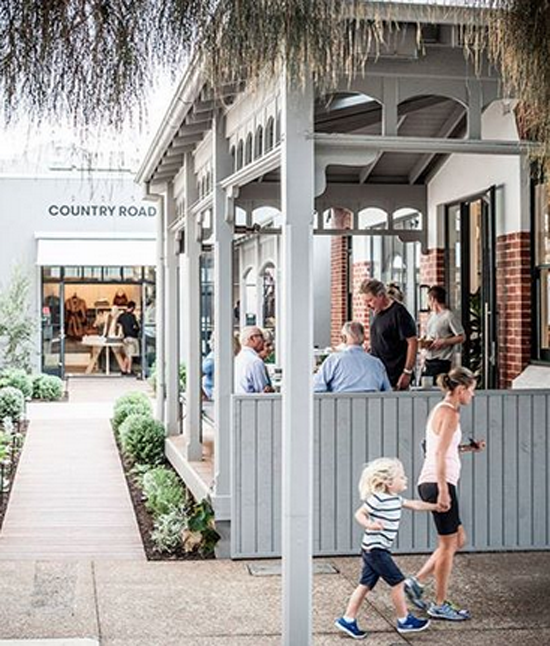
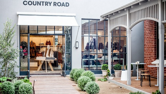
Firstly, I am pleased to report the doubters were wrong!  Secondly, you only need a few hours and not a full day (it’s about a 30 min drive from inner Brissy). Once you’ve taken in the views of gorgeous old Queenslanders and historical buildings I suggest you head straight past the ‘WTF’ and right on into the ‘Top of Town’ (home to a small cluster of on-trend shops and cafes).

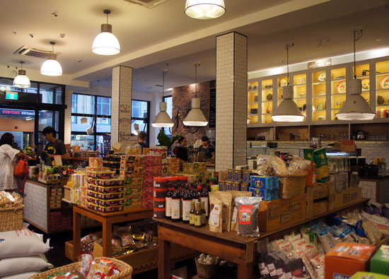
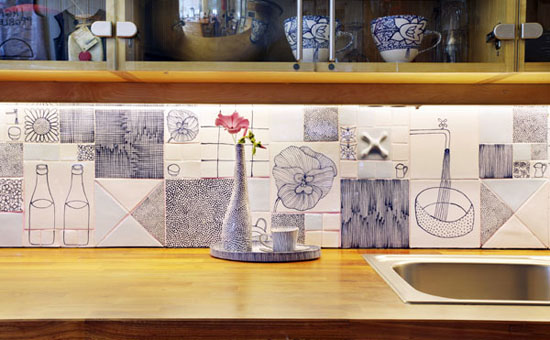
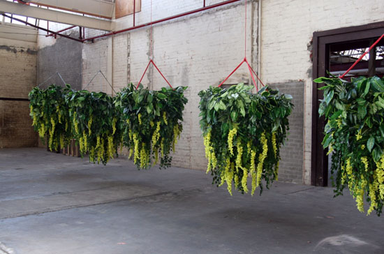
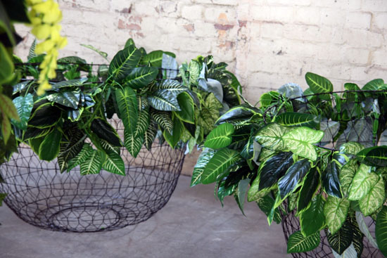
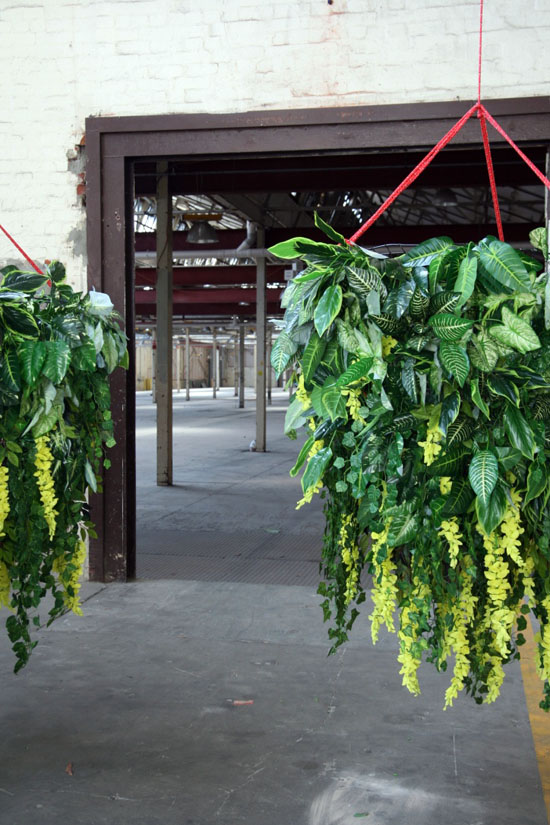
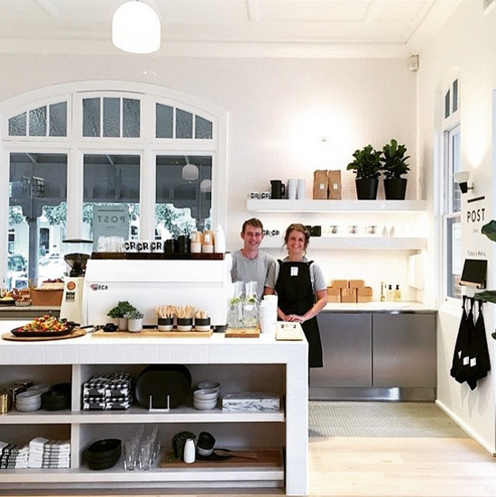
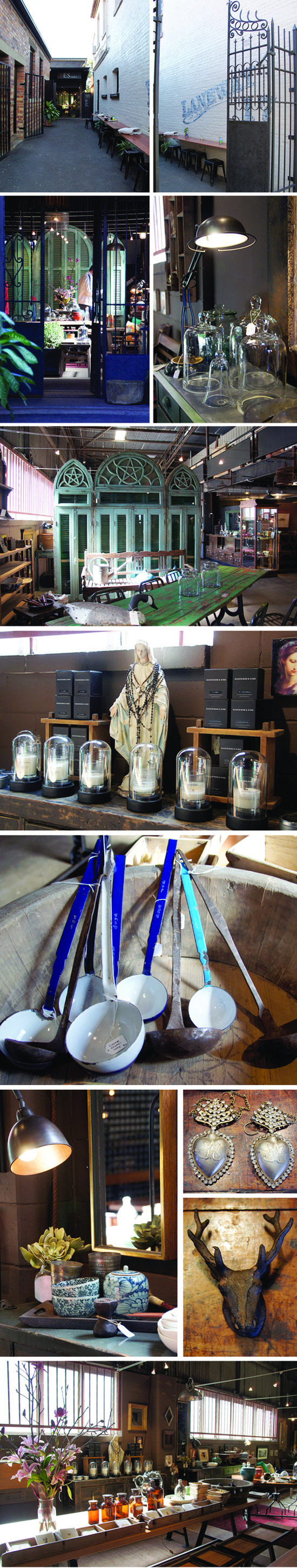
Pictured above is Stuart Ellis’s treasure trove of old and new furniture, objects and art. Fabulous finds like imported windows from Paris and restored iron gates from Egypt sit along side locally made artisan book cases and the like. This old plumber’s shed is mostly made up of retail, but venture to the very back and you will find the workshop where restoration of precious pieces is also part of the story.

After doing retail time in Brissy (Tennerife), the move to Ipswich by ES Traders is a clue that the town is undergoing somewhat of a retail renaissance being lead by Stuart and a sprinkling of seriously stylish neighbours. I’ll be heading back for a coffee at the mod little cafe that sits at the start of the lane, do a little more snooping and see what new surprises he has in store.

You can find ES Traders in Bon Laneway, 17C Ellenborough Street. Open 10.00 – 3.00 Tuesday to Sunday. Closed Mondays.

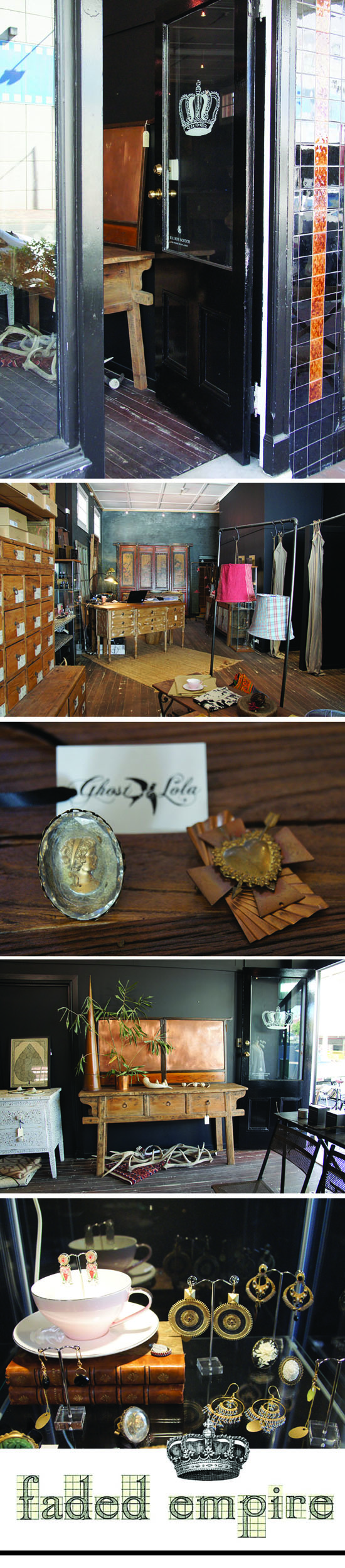
A few doors up you will find the Traders newest neighbour, Faded Empire offering a small range of women’s designer labels (think Maison Scotch etc), some striking costume jewellery (Ghost & Lola etc), Kantha lampshades from India and other wares for the home. The owners description is ‘a contemporary store with an old soul’ which sums it up perfectly. Love their logo too.

POD_faded empire_Ipswich

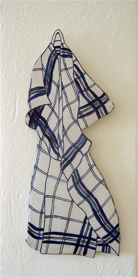
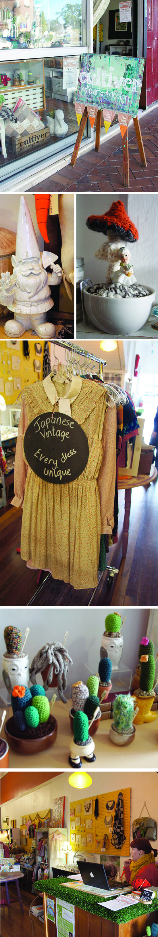
Just around the corner on Brisbane Street Cultiver offers a youthful mix of vintage, indie designer homewares (some fab screen printed tea towels and the like), slightly kooky accessories, quirky crocheted cacti and hand made greeting cards.  There is a lot more to this store but that is my immediate recall as I sit and tap this out late in the evening a week later.

POD_Brisbane St_Ipswich_Cultiver

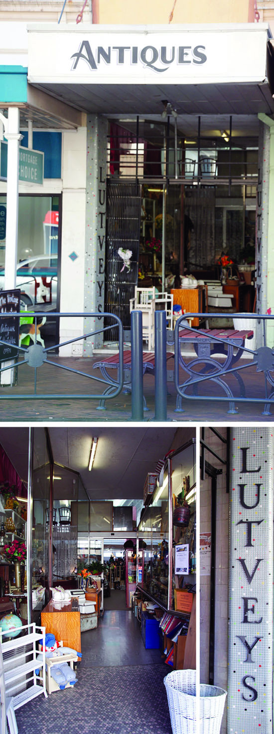
A few doors further up the street you can take a snoop through some second hand treasures. In addition to the scent of  ‘must & moth balls’ I am sure you could sniff out a bargain or two at Lutveys.

POD_Brisbane St_Ipswich

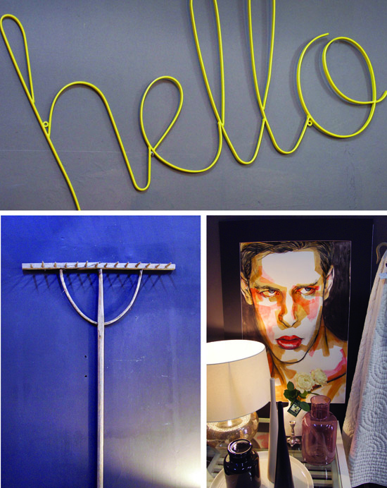
By now you are just about at the top of the town. Province is a retail front for an interior design business and a nice addition to the neighbourhood.

POD_Province_Ippy

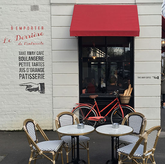
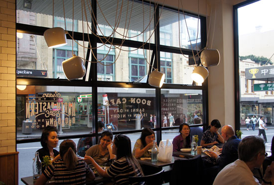
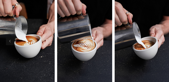
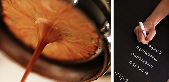
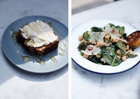
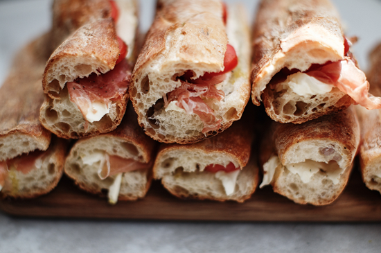
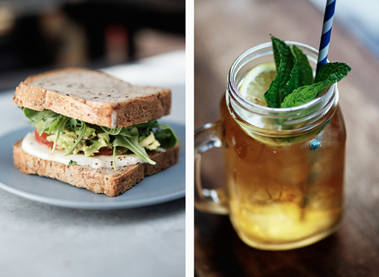
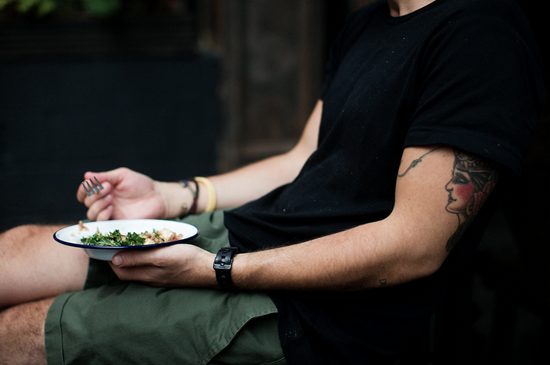
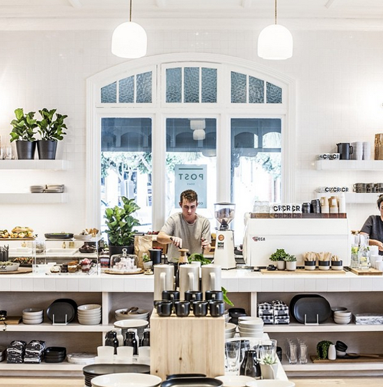
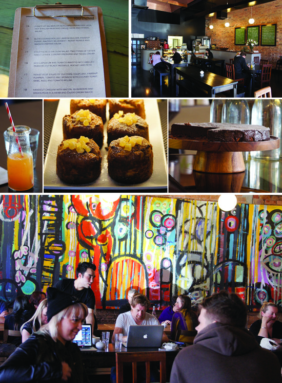
Once you have had your fill of homewares etc. I suggest you walk over the road to The Fourth Child for a coffee, brunch, lunch or whatever. Mother of three and owner, Amanda Robertson, had an established following for her cakes which she sold through market stalls but from what I can gather she was not content with mere baking and babies (or having enough on her  plate obviously??). She went on to have her ‘fourth child’ and by doing so branched out from baking to an all day cafe model with a paddock to plate / locavore (100 mile / 160km radius), sustainable, ‘do the right thing’ type ethos. It appears to be working.  The ‘child’ was on it’s best behaviour when patrons packed the place out last Wednesday lunchtime.  My count of ‘bums on seats’ suggests that the locals really like it.

POD_4TH CHILD_IPPY
I have to admit my expectations for finding retail inspiration in Ipswich were low. I love it when I am taken by surprise (which is something of a challenge when you have been looking at retail for as long as I have!).  Thanks to all the fine Top of Town people I spoke to and letting me share my version of their story.

Ipswich
July 30, 2013 Comments (0)

Design & the Bottom Line

Mid way through last year the owners of a ‘run of the mill’ cafe in Kew decided they wanted to ‘get a bit groovy’ and appeal to a more urban bod / ‘Yummy Mummy‘ type living in this well-heeled leafy suburb. Some good advice from a regular coffee client (an architect) was … “engage a good interior designer and work with what you’ve got“. Comer & King got the gig along with very modest budget (nothing new there, but in this case spent with maximum effect … which is why you call in the expert in the first instance isn’t it? ).

Once a new name, brand identity and colour palette was established and the interior concept agreed the C&K team got busy. A couple of dodgey old doors were replaced bright blue new ones (hard to miss as you are driving down High Street and the owner’s loved the idea … “we thought it was brilliant – we really stand out on the street now”). Freshly painted tones of steel blue, charcoal and taupe gave the dining spaces definition. A side board was painted and relocated.  Popular pop blue Tolix chairs, new tables, some fab light fittings, an oversized clock, a collection of plates with friendly food motives (hand drawn by Cameron Comer) and a bicycle bolted to the wall completed the transformation. Seating was reconfigured to provide 20 more seats (70 in total).

The owners are delighted with the results, both aesthetically and from a customer perspective (they are voting with their feet and wallets … which was the intended outcome of the exercise).  Without wanting to appear too nosey about their business, I understand they are now grinding through a lot more kilos of coffee each week and a strong Saturday trade has been established (a poor trading day before the make over) (FYI there were also line ups out the door and down the foot path in the first few weeks after re-opening which has now settled into a solid, sensible pace!)

Initially regulars thought the cafe was under new management. They soon figured out it was the same owners and same chef serving up their familiar favourites. Within a week or two word had got around and they were back … along with a whole swag of new customers who had not considered it an option previously.  I do love the pulling power of good design. Done well, it makes a big difference to the bottom line. Nice work by Comer & King who did both the branding and interior.

Fat Penguin, 713 High Street, Kew East, Melbourne.

To see more gorgeous interiors work go to www.comerandking.com

And for a peek at what it looked like before the make over …